font trio revisited
Iota rapidly established itself as the default font on my ereader. It is a very unique yet highly readable font and sported the single-storey lower case a which i am drawn to for the added openness it renders to the page—further emphasized by the “open” glyph choices of the Iota font.
articulate and typograffic fell into a bit of disuse simply because they were historical points in the progression to Iota—their differences from the font somewhat nuanced.
In this endless exploration of fonts i decided to revisit them—all of them as it would turn out with the return to the serifless lower case j. At 300PPI the serifless glyph is still quite legible and harkens back to its earlier usage, so i revisited the fonts to see what could be done to render them more distinct from each other while retaining the overall dyslexic character of the trio.
dyslexic tunings
the asymmetric glyphs common to all three typefaces remains..
| lower case | from hyperlegible shape | to dyslexic shape |
|---|---|---|
| b | toothed | toothless-rounded |
| d | toothed-serifless | |
| p | eared | earless-corner |
| q | hook-tailed (mapped glyph*) | |
| n | straight | |
| u | toothed | toothless-rounded |
To achieve the “character” differences i was seeking, i decided to revisit the font heritage which influenced the glyph choices to begin with..
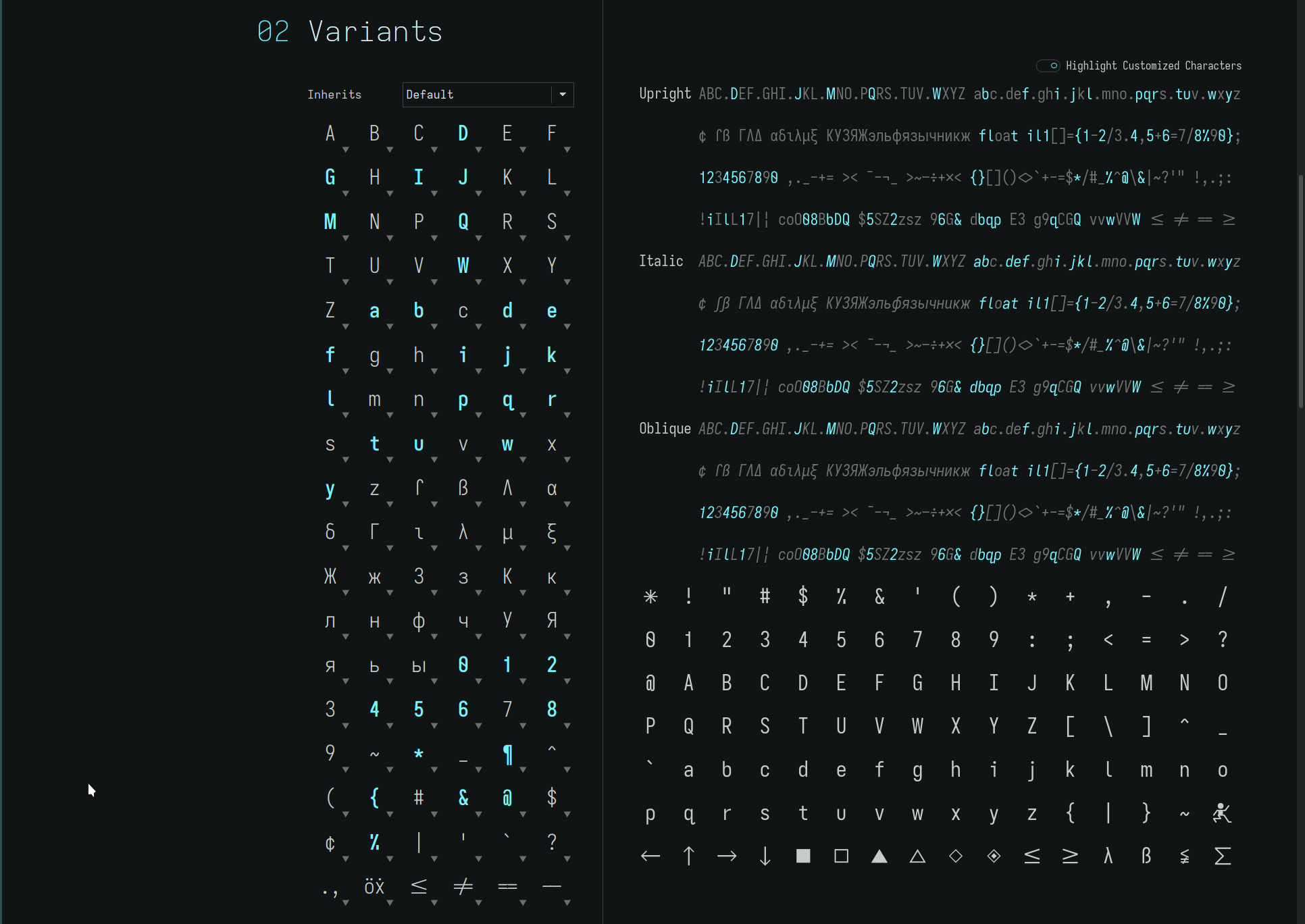
atkinson hyperlegible
remains the most influential font, providing the base glyph set that was tweaked for dyslexia. Along the way several of the upper case glyphs were changed, notably the crossed capital Q—my being decidedly biased against dense glyphs.
At 300PPI, however, this is not a legibility issue, so the articulate font returns to..

with..
| upper case | from prior shape | to hyperlegible shape |
|---|---|---|
| G | toothed-serifless-hookless | toothed-serifless-hooked |
| J | descending-flat-hook-serifless | serifless |
| Q | straight | crossing |
| lower case | from prior shape | to hyperlegible shape |
|---|---|---|
| j | flat-hook-serifed | flat-hook-serifless |
This is a decidedly highly legible font very closely matching the Atkinson Hyperlegible Font.
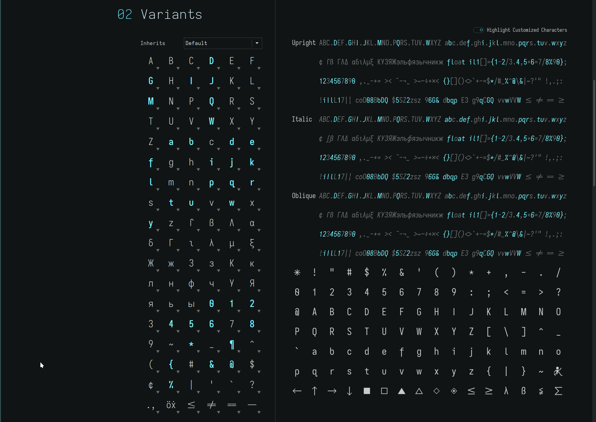
univers grotesk
with the serifless capital I and double-storey lower case a, typograffic gets a similar face lift to complement its descending lower case f..

with..
| upper case | from prior shape | to grotesk shape |
|---|---|---|
| G | toothed-serifless-hookless | toothless-rounded-serifless-hooked |
| I | serifed | serifless |
| J | descending-flat-hook-serifless | flat-hooked-serifless |
| Q | straight | (unchanged) |
| lower case | from prior shape | to grotesk shape |
|---|---|---|
| a | single-storey | double-storey |
| f | flat-hook-extended-crossbar-at-x-height | (unchanged) |
| j | flat-hook-serifed | flat-hook-serifless |
Save for the dyslexic tuned glyphs, typograffic now more closely resembles its Grotesk roots.
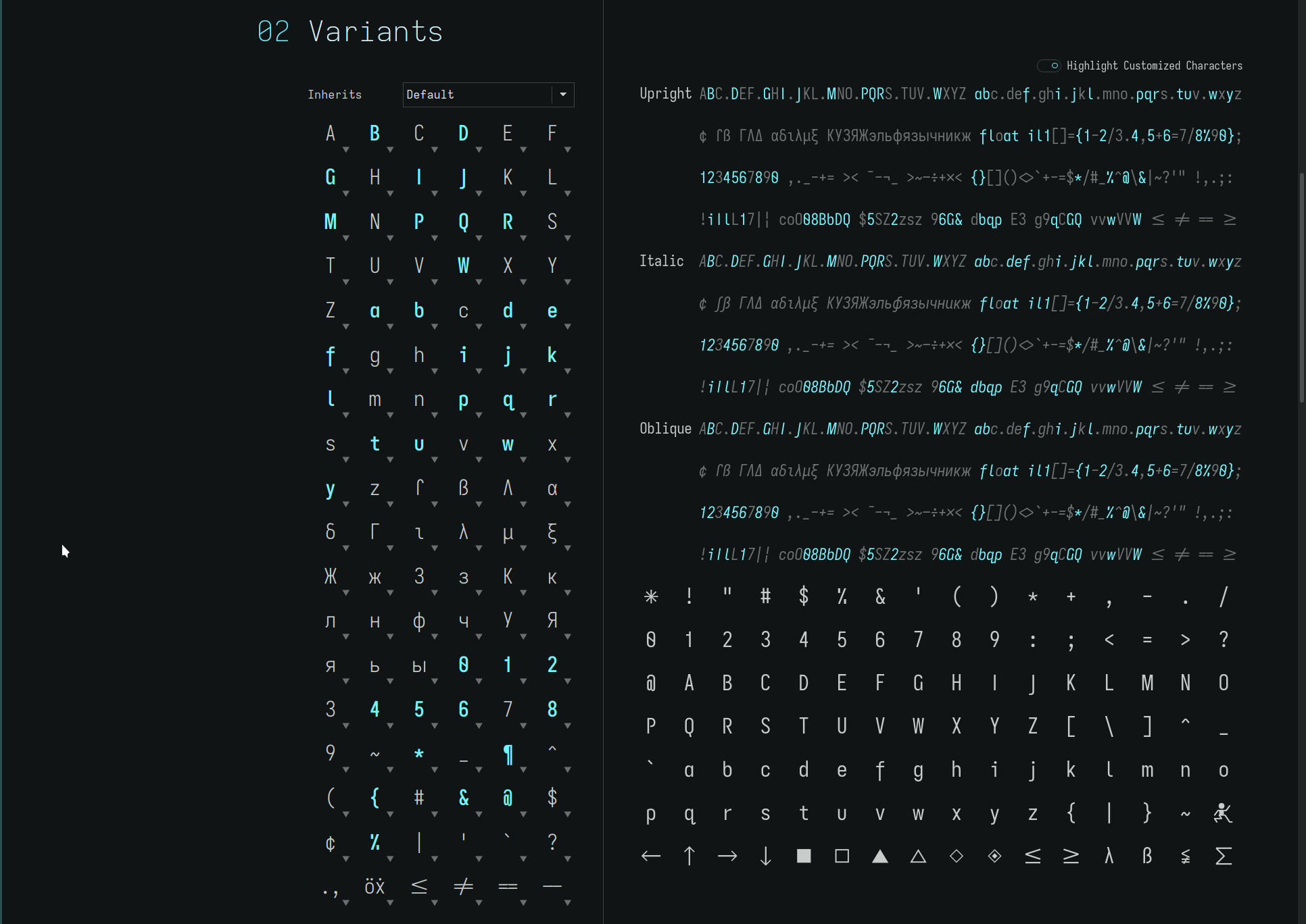
Iota
has just a minor change..

with..
| upper case | from prior shape | to Iota shape |
|---|---|---|
| B | standard-interrupted-serifless | (unchanged) |
| G | toothed-serifless-hookless | (unchanged) |
| I | descending-serifless | (unchanged) |
| J | descending-flat-hook-serifless | (unchanged) |
| P | open | (unchanged) |
| Q | straight | (unchanged) |
| R | straight-open | (unchanged) |
| lower case | from prior shape | to Iota shape |
|---|---|---|
| a | single-storey-serifless | (unchanged) |
| f | flat-hook-extended-crossbar-at-x-height | (unchanged) |
| j | flat-hook-serifed | flat-hook-serifless |
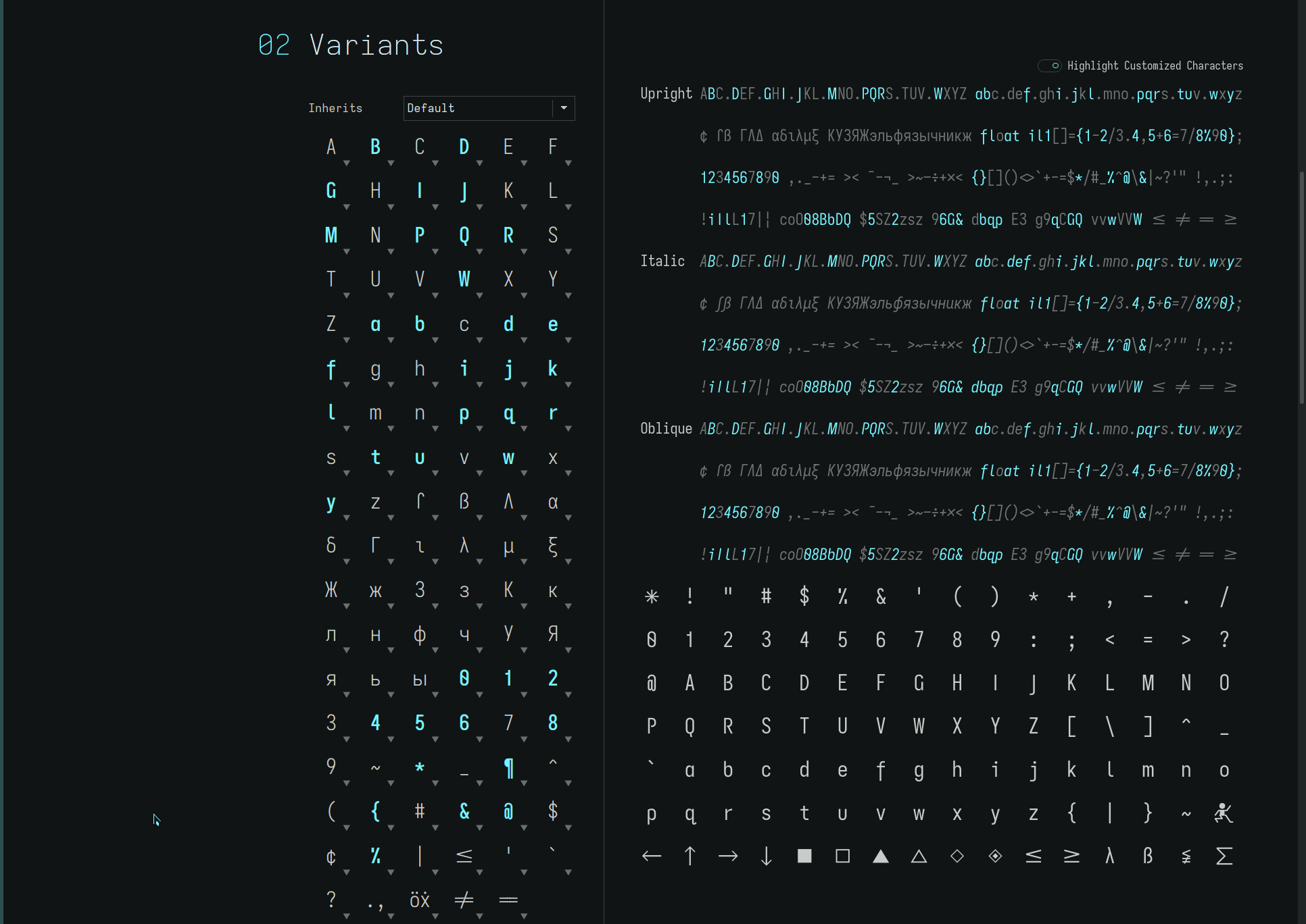
Note: The capital I in the exhibit is the serifless glyph from the Iosevka web page—and not the glyph created for the font. Similarly, the lower case q for the three fonts is replaced by the unicode hook-tailed glyph.
All told though, typograffic differs from articulate by 5 glyphs and
Iota from typograffic and articulate by 7 glyphs and 9 glyphs
respectively. See if you can spot them :)
Note: iota has the descending capital I which is not
represented in the screenshot.
i expect to be an outlier in my fondness for the iota typeface. But with the changes made to its predecessor fonts, the articulate and typograffic fonts should find a wider audience with their more familiar glyph sets.
Edit: Recently, i’ve been reading with the previous version of
Iota with the serifed lower case j. It just feels
more “right” with this typeface (to my eyes) despite my Grotesk
leanings—aligning with my non-mirrored dyslexic rule, even though it
still is a J. In this instance, the serifed separation of the dot
distinguishes the lower case glyph from its
descending-serifless upper case counterpart, especially at small font
sizes. i am no neuroscientist but i surmise this
reflects a visual cortex pattern (memory) expectation of
glyph shapes while reading with a specific typeface, hence, the benefit
of the contrasting outline—the distinction lessening the visual
effort to determine the case of the word and the context it implies.
Edit: Further to the above remark, i have been switching between the
sans serif and
serifed lower case j versions of the articulate and typograffic
fonts. On the one hand is the clean sans serif glyph vs the slightly
more legible serifed glyph (despite the distinctive upper and lower case
glyph shapes) . Not that it in any way is ugly. One is
airier, the other ever a touch more balanced (in relation to its side
bearing to leading characters)—a very personal visual bias. It is a tough call—and i am glad that
both versions are available in the repos :)

readability
ranking order tightens up between the articulate and typograffic fonts with these changes. Before it was distinctly articulate first and a toss between typograffic and Iota. Now articulate and typograffic are a very very close one two with Iota remaining third on the podium—still a lovely typeface.
The crossing capital Q for the articulate font returns the familiar and distinct glyph. Similarly, the serifless lower case j is restored—albeit its dot loses a bit of separation with the loss of the serif at small font sizes.
The typograffic font gains the most in the readability scale with the return of the double-storey lower case a and the rounded-hooked capital G. The serifless capital I, often a readability issue with geometric fonts, differentiates itself against typograffic’s remaining glyph set.
Iota doesn’t make any gains in readability. Its descending capital I is highly distinct but the thrust of the font with its open hookless capital G and single-storey lower case a for a more open font loses a few points for those with impaired vision—especially at small font sizes—whilst gaining a few (IMO) with its clean minimalist geometry and unique yet understated flair. i adore this font.
For everyone else, the articulate and typograffic fonts offer two
highly readable fonts with slightly different grotesk flavourings. (But
you still might do well to give Iota a glance—i find it enticingly
seductive :)
Note: This web font is a hybrid of the font trio—augmented
with vertical-crossing capital Q and serifed lower case j for
better readability with
the lower resolution of desktop screens in general.
repos
The new ereader fonts may be found on OneDrive under the font-trio folders within the Kindle and Kobo folders.
The j-serifless subfolder contains the fonts described above. The j-serifed subfolder retains the serifed lower case j for those who prefer its extra degree of legibility. The original trio of fonts remain available
As always, YMMV.
acknowledgement
while it has been referenced multiple times in prior font articles on this site, it goes without saying that none of this font exploration would have been possible without the generosity of the creator of Iosevka—both the font generation itself and the glyph screenshot exhibits taken from its home/customization page—and those involved with the opensource FontForge project.